Public transport with stories on the walls
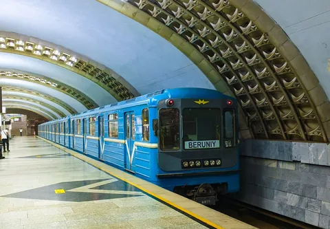
Tashkent's metro opened in 1977. Its stations give public transport a strongly architectural setting, with different combinations of stone, lighting, mosaics and imagery. The network is a working part of the city, so looking at a station means sharing it with people who have a train to catch.
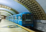
This guide uses Kosmonavtlar as its reference point. Opened on the second line in 1984, the station takes space exploration as its theme. Blue wall surfaces, dark columns and portrait medallions give you a specific story to follow rather than a general claim that every station is beautiful.
The most useful comparison is between movement and attention. Platform signs and train doors need to be found quickly. The decoration rewards a slower look. Notice how the two occupy the same space, and keep clear of the platform edge and passenger flow while doing so.
A system built in stages
Construction began in 1973, and the first line opened four years later. The second line followed in 1984. Later expansion continued after Uzbekistan's independence, so the network is not one design from one moment.
That is worth remembering if you move between stations. A repeated system of tracks and platforms can contain quite different architectural treatments. Station names, materials and images supply distinctions within the same practical transport network.
Use the current operator map for transfers and service information. This place story is not a journey planner, and the pin at Kosmonavtlar does not claim to represent every entrance or an accessible route through the system.
Space history at Kosmonavtlar
The Tashkent Modernism project documents the station's design by Sergo Sutyagin and Sergei Sokolov. The decoration connects myth, astronomy and modern spaceflight. Its subjects include Icarus, Ulugh Beg, Yuri Gagarin and Valentina Tereshkova.
Those figures do not all belong to the same kind of history. Icarus is a figure from myth. Ulugh Beg studied the sky centuries before spaceflight. The cosmonauts belong to the twentieth-century Soviet programme. Placing them together constructs a story about the ambition to reach and understand the sky.
If you can see the medallions, choose one and identify the person before looking for the next. Then compare the images with the surrounding blue surfaces. The portraits provide individual subjects; the colour and lighting create the setting in which you encounter them.
Compare without rushing
The research project's account describes wall colours grading from white towards ultramarine and dark glass on the columns. These are choices intended to affect how the underground space feels, rather than simply to cover its walls.
Your view will also depend on ordinary conditions: a train arriving, other passengers and the position from which you can safely look. There is no need to wait for an empty platform to appreciate the station. Its transport use belongs to the experience.
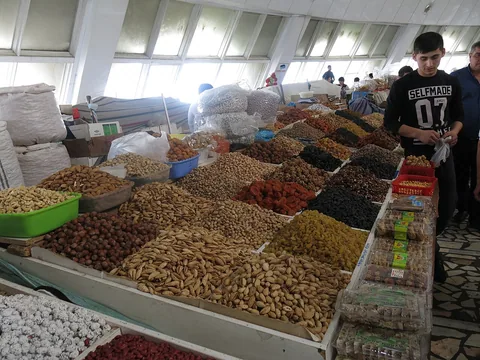
For a contrast above ground, pair the metro with Chorsu Bazaar. Both are modern projects organised around everyday movement, but their public spaces work differently. At the market, people stop at stalls and choose goods. On the metro, most are trying to keep moving. The decoration has to live alongside those different habits.
 EXPLORE THE CITYTashkent city guideRead the city guide ↗
 🕌
🕌 🧺
🧺 🕌
🕌 🚇
🚇 🌳
🌳 🏛️
🏛️ 🎭
🎭 🌳
🌳 🏛️
🏛️ 🕌
🕌